Web Design Tips to Avoid a Slowdown in e-commerce Sales and Services
Websites are undoubtedly the new shop front. Today, people rely largely on digital platforms to do online shopping, and this trend has given a great boost to the e-commerce industry. Merchants and business owners strive to create a great online presence for their e-commerce business when it comes to attracting more and more buyers online. More often, they try to accomplish this by choosing an optimal web design for their web platform.
A good e-commerce website design can be an effective strategy to skyrocket business sales. It can have a great impact on customers “walking” in and out of your online store. It is worth noting here that a good website is not just about aesthetics, but about its usability and accessibility too. From the smallest venture to the biggest enterprise, building an online website that is catchy and that offers a rich user experience can generate a lot of leads for your e-commerce retail platform.
In this article, we are going to address the basic web design strategies that we’ve found can add a great boost to e-commerce sales and revenue. A great website starts with the fundamentals, and here’s how you can convert your website from being dull into something helpful and dynamic:

Keep your web design simple.
It’s true what they say: Simplicity is the ultimate sophistication. The same goes with your website designing approach. Simple is always better. Think about being in the user’s seat: Would you like to click through five pages to get the information you need or deal with a million pop-ups when arriving at a website?
People don’t like cluttered information. Simple website design tends to be rated as more trustworthy and visually appealing than ones that have complex designs. Simple website design elements include:
- Easily readable and engaging content.
- Simple and legible fonts.
- Unified color schemes.
- Easily navigable product and services lists.
- White space.
Emphasize visual marketing.
Using high-quality images as well as videos for your products can draw better customer conversion rates for your e-commerce business. Clean and professional shots of your products should be featured at the front and center of your web design.
You can also use color psychology on your website to make your site more purposeful. Making use of certain colors can evoke certain emotions in people. For example, in some cases, blue can add feelings of trust and sleek blacks and shiny golds can be used to convey the idea of a luxurious or an expensive item.
Hence, color images and videos can offer your website a sound facelift and can motivate buyers to take action.
Make your website mobile-friendly.
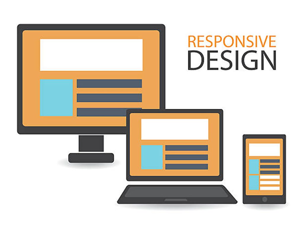
It’s important to stick with the latest trends to derive valuable worth out of any business. Younger consumers, like millennials and Gen Z, rely immensely on their smartphones to do web browsing or buy things online. So, it is necessary that your web platform be mobile-friendly. If your site is not able to load on a mobile, then you are going to lose substantial clients and sales. The site must maintain the same functionality and clean look on mobile as it offers on your desktop site.

Your website should not lag in speed.
One of the prominent website design factors to foster e-commerce sales is that your website should be fast enough to operate. You have a better chance of customers staying on your website if it’s speedy and shows few disruptions. Considerably, a lagging page makes people pass judgments about your website and possibly on your brand as well, even if they have not seen a single product on your online shop.

As per research, a majority of people will remain loyal to a website only if it shows great speed. To avoid slow loading time, try to keep with the simple theme by avoiding overcrowding your e-commerce store with a bunch of interactive graphics. Instead, use high-quality JPG images—they are just fine for the web.
Make the checkout process easy for customers.
One always conducts great efforts to make their e-commerce website design more productive and revenue-driven. Therefore, when it comes to devising your checkout process online, make sure your customer gets to the finish line performing fewer formalities. You must offer your online shoppers easy checkout processes, like giving them the option to check out as a guest. You should also consider using fewer data fields that must be filled in and clearly label those data fields.

Be upfront about your website policies and rules, like what shipping options are available and how much they will cost. Your return and exchange policies should also be included online for a little extra peace of mind as it builds brand trustworthiness and lends your site more credibility.
Conclusion
This Web Design Tips to Avoid a Slowdown in e-commerce Sales and Services is basically talking about the website design tips that will help e-commerce to sell more.
